
Design Better User Journeys with Smarter Button Controls

The Button Element just got a major upgrade, unlocking more control, better navigation options and simpler setup for user flows across both the borrower and intermediary portals.
These improvements make it easier to design user journeys that are interactive, intuitive, and aligned with real-world use cases.
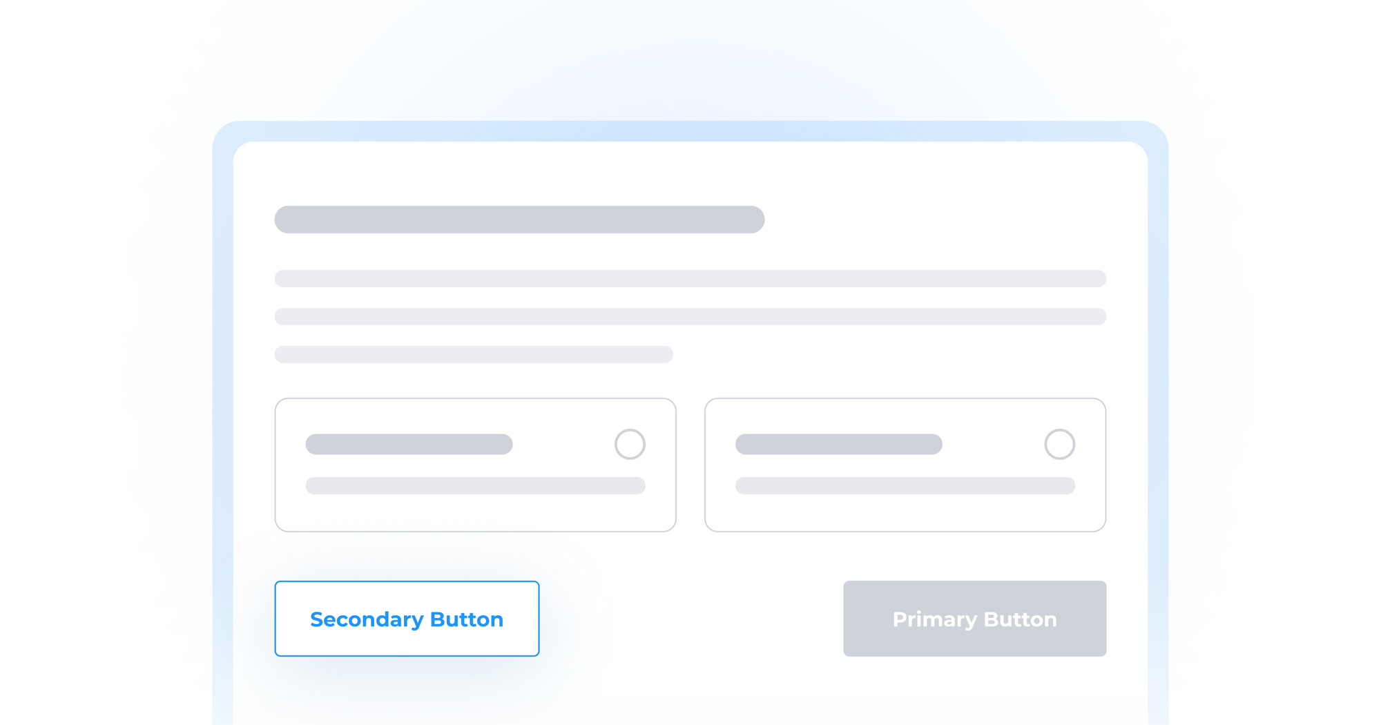
Secondary Buttons Are Here
Sometimes, one button isn’t enough.
Now, you can add a secondary button alongside your primary one - each with its own name and behavior. This opens the door for handling use-cases like “Back” to return to a previous step or “Skip” to bypass optional pages.
Give users clear, flexible options that keep them moving forward or let them go back when needed.
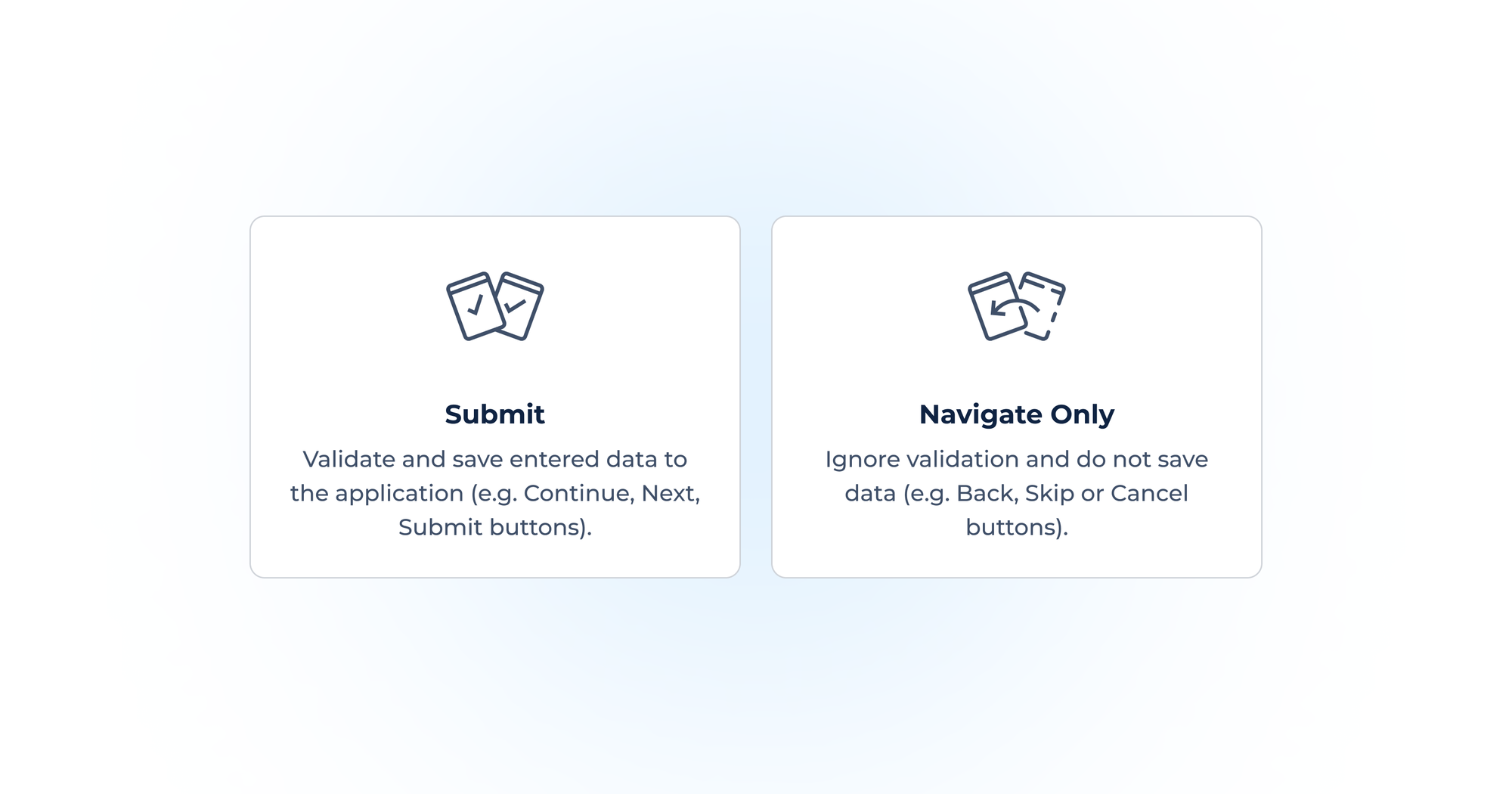
Control Button Behavior
Every button now has a new setting, which determines how it behaves:
- Submit: Validates all required fields and saves the data to the application. Use this for actions like “Continue” or “Submit”.
- Navigate Only: Bypasses field validation and doesn’t save any data. Perfect for “Back”, “Cancel” or “Skip” buttons that shouldn't block the user.
This eliminates the need for extra logic or duplicated screens just to support simple navigation behavior.
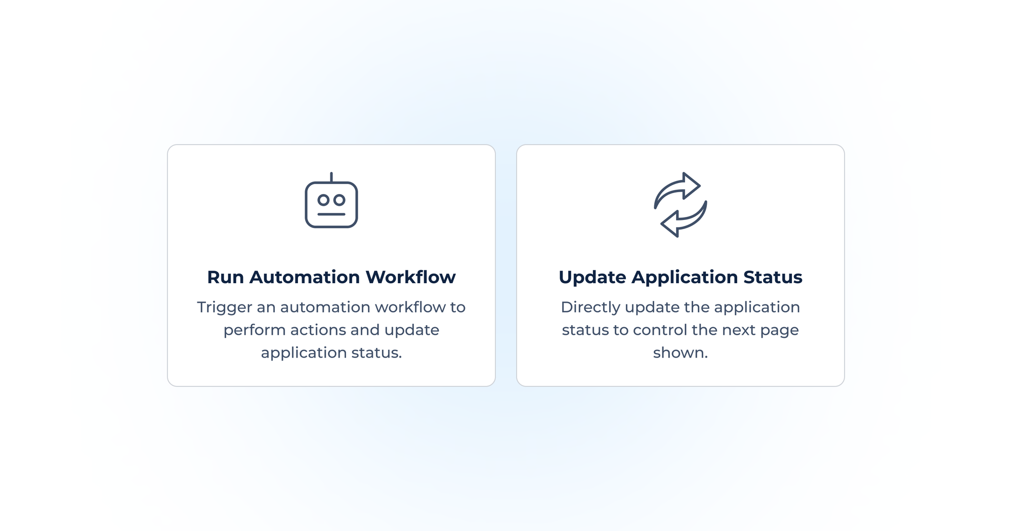
Defining the Next-Step Action
Buttons now let you run a simple status update, with no need to create an automation for every scenario.
You can now pick between:
- Run Automation Workflow: Launch a custom automation workflow (as before).
- Update Application Status: Simply move the user to the next page tied to a status.
This is especially useful for common actions like “Back” or “Skip” that don’t necessarily require automations. It reduces the need to build and manage a large number of workflows just for navigation.
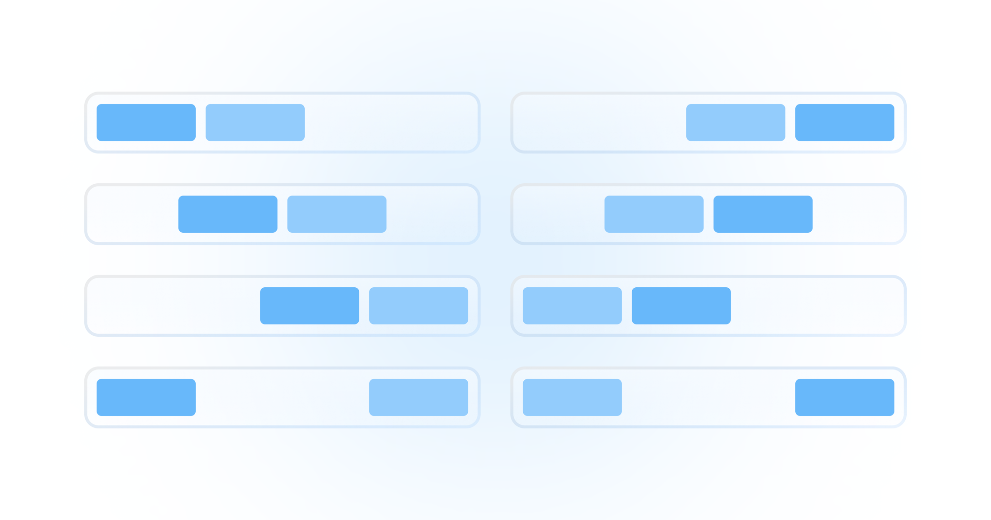
New Button Layout Controls
Primary button on the left or right? Everyone has a preference - so we’ve made it your call!
We’ve added more ways to customize how your buttons appear on the page:
- Button Alignment - including a new “Justify” option.
- Button Order - choose whether the Primary or Secondary button shows first.
All these details give you more control over the visual flow and make it easier to match your design standards.
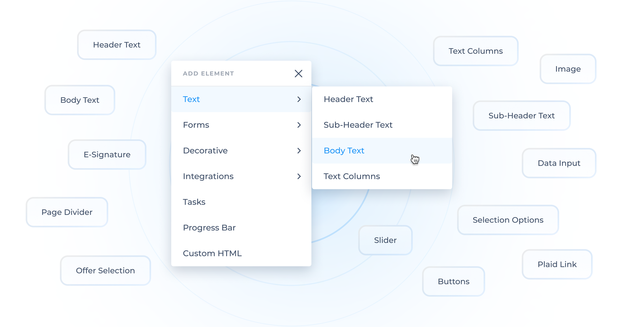
A Cleaner, Smarter Elements Menu
As the library of page-building elements continues to grow and improve, we’re making it easier to keep up. The elements menu has been reorganized with categories and logical grouping, so you can find the right elements faster without endless scrolling.
These enhancements are all about empowering you to build more dynamic and user-friendly portals, while making setup fast and manageable. The result? A more intuitive experience for both users and builders. Head into the page builder to try out the new button experience.